
Bread crumbs depicted in any of the following illustrations for the Widget pages are not available when using Microsoft® Internet Explorer® 8.
Widgets are an upgrade for classic Dynamic Objects that are available for use on the pages created by the Classic WYSIWYG Page Editor. Widgets have a more modern look and feel. They are HTML5 compliant and 508 compliant. Unlike Dynamic Objects, Widgets are managed in one central location. You can change them once on the Widgets page, and they update everywhere they are used in your LearnCenter. There are currently 2 Widgets:
Additional Widgets are being developed. The Widgets are intended for use with pages created by the new LearnCenter Designer. They will not work on pages created by the Classic WYSIWYG Editor. Likewise, classic Dynamic Objects will not work on pages created by the new LearnCenter Designer.
|
|
Bread crumbs depicted in any of the following illustrations for the Widget pages are not available when using Microsoft® Internet Explorer® 8. |
On the ControlPanel:
 on the LearnCenter Design
menu to expand it.
on the LearnCenter Design
menu to expand it.
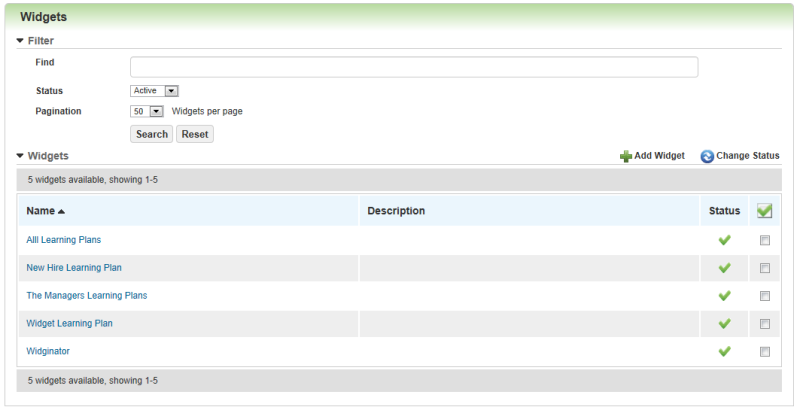
All of the Widgets you have created are available on this page. You can sort by Status (Active, Inactive, or Both), and you can indicate how you would like this page to paginate by selecting a number from the Pagination drop-down list. You can use the Find search box to locate Widgets by name or partial name. You can make Widgets inactive if you are no longer using them.
 .
.Once you have created Learning Plan Widgets, you can add them to either Page Templates or Pages.
Widgets have been developed to have "responsive design", which means you can reshape a window or open the page containing the Widget on your mobile device, and the Widget re-sizes appropriately for viewing. Responsive web design (RWD) is an approach to web design aimed at creating web sites that provide users with an optimal viewing experience, easy reading, and simple navigation. RWD means minimal resizing, swiping, or scrolling. RWD works across a wide range of devices, including desktop computer monitors, tablets, and mobile phones.
Notice how Widget layout remains consistent even when re-sized like the example below.
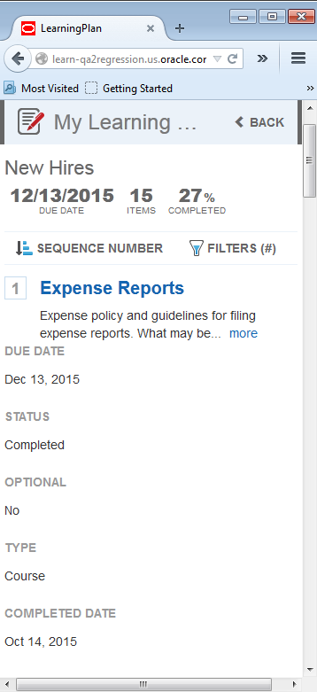
When a Widget page is minimized to fit an extra small display (such as on a mobile device), the mini dashboard is simplified and some of the less critical items are hidden.
In the example above, notice that the Widget has been resized to a smaller format and that only three headers display (Due Date, Items, and Completed). The following are hidden by page:
|
|
The hidden information is still accessible by scrolling down to the event content. |

Copyright © 2010-2015, Oracle and/or its affiliates. All rights reserved.
 Related Topics