When you add a new page to your LearnCenter, you should set certain options for it to make it more identifiable (when a page is initially created it is assigned a number not a name) and to make it accessible to Users.
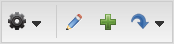
 and use the drop-down list to locate and select the page you want.
 to place the page in Edit Mode.

 ) to open the Header Editor and change the page header for the current page. This includes uploading the header you or your graphic designer have designed for your page using a third-party graphics software package.

|
If you have clicked the Edit Page Header button () and have made updates to
your header, the Remove Header button ( ) displays. To remove this header and
restore the default LearnCenter header, click . This button only displays if you
have modified the default or created your own page header. ) displays. To remove this header and
restore the default LearnCenter header, click . This button only displays if you
have modified the default or created your own page header. |
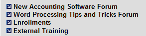
 ) to display or remove a link to the page on the Left Nav Bar. A red “x” indicates a link to the page does not currently display on the Left Nav Bar. A green check mark indicates a link to the page does currently display on the Left Nav Bar. Pages that display on the Left Nav Bar look similar to the following illustration.
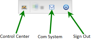
 ) to display the User Control toolbar in the Left Nav Bar for this page. A red “x” indicates the User Control toolbar does not currently display on the Left Nav Bar for this page. A green check mark indicates the User Control toolbar does currently display on the Left Nav Bar for this page. The following illustration is an example of the User Control toolbar.

|
If you are using only a subset of LearnCenter features, consider hiding User Controls and designing custom pages instead. If you hide the User Links for a particular page, any page links elsewhere in the LearnCenter that point to this page must include the following at the end of the HTML code for that link: &userlinks=1. |
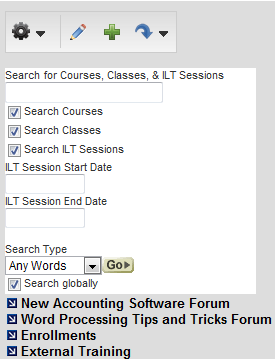
 ) to show the page header on this page. A red “x” indicates the page header does not currently display for this page. A green check mark indicates the page header does currently display for this page.
 ) to show the Left Nav Bar on this page. The contents of the Left Nav Bar can be customized. A red “x” indicates the Left Nav Bar does not currently display for this page. A green check mark indicates the Left Nav Bar does currently display for this page. The Left Nav Bar looks similar to the following illustration.

|
Displaying the Left Nav Bar affects the dimensions of the content in the main content area. |

Copyright © 2010-2018, Oracle and/or its affiliates. All rights reserved.
 Related Topics